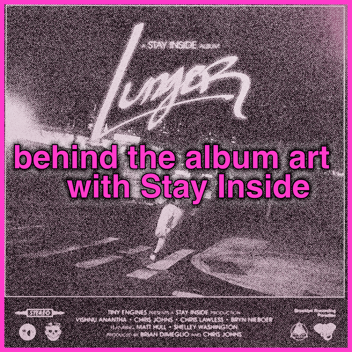
behind the album art with Stay Inside
More and more are saying Stay Inside are a great band that makes awesome music. The Brooklyn foursome (Chris Lawless, Bryn Niboer, Chris Johns and Vishnu Anantha) put out Ferried Away, an album of poignant rippers, in early 2024 and it was the most critically acclaimed release of their career—I think it made a couple of publications's Best Of lists, though Google is so broken I cannot fact-check myself on this, let's just say it's true. Would I lie to u?
Now they are back with Lunger, which takes their usual blend of emo, post-hardcore and uncategorizable alt rock and levels it up with cutting/comedic lyrics, idiosyncratic arrangements, and Even More Instruments Than Before. If you liked the trumpet on Ferried Away you'll love the trumpet on Lunger and you might also accept into your heart some flute, flugelhorn, and cowbell.
"Ain't That A Daisy?" is a perfect example of the multi-instrumental controlled chaos that is afoot; sprightly melodica shares space with 'music video set at out of control house party in the suburbs' guitar for a part-rager, part-cabaret moment that you could call a...cabarager. Also the outro of "Wish It Away" involves a solemn, deep voice asking the question "Am I sitting here eating spaghetti by myself tonight?" which is just insane.
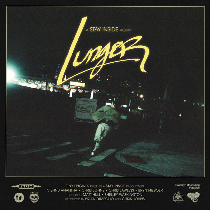
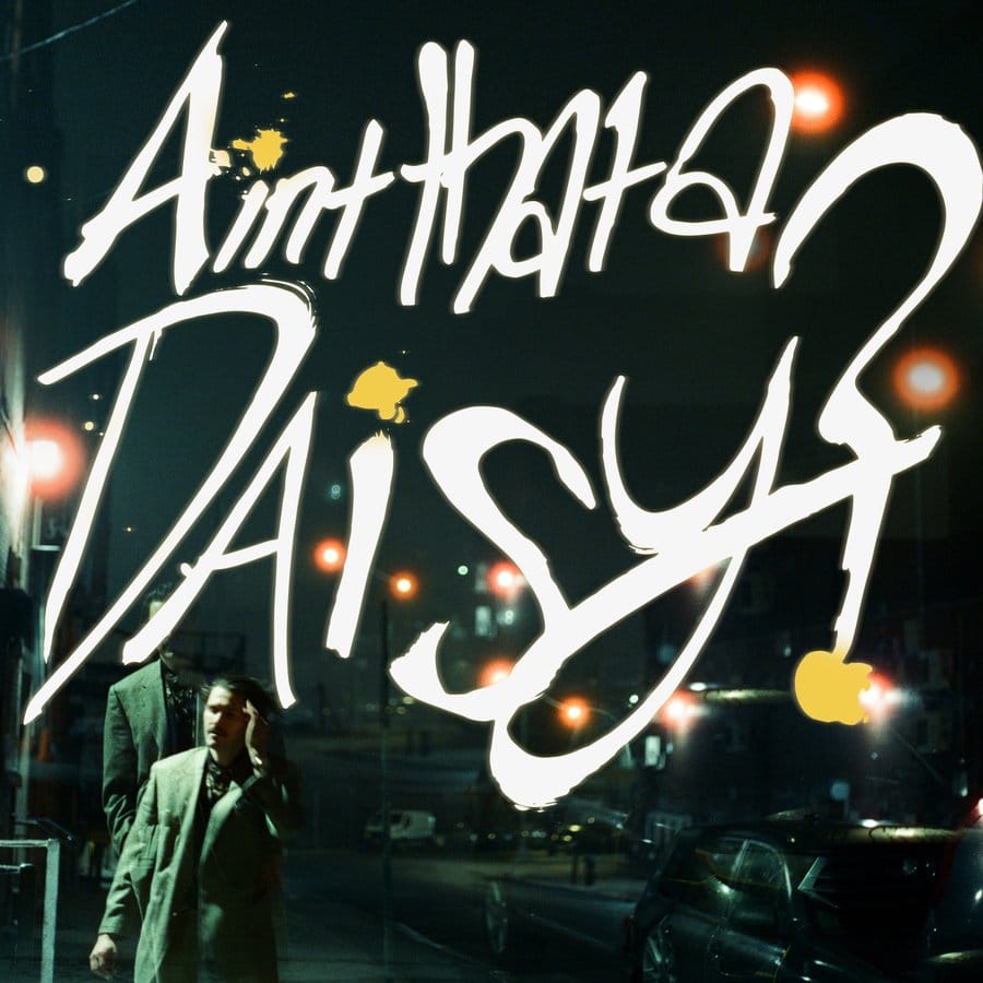
The album art for Lunger is super cool—dramatic lettering! oblique photography! a movie-style credits list on the actual cover!—and I got to ask Bryn about the making of the art, and how it relates to the music itself. Interview below this very line...
[Molly Mary O'Brien] I saw you post that you had "a really specific idea" about how you wanted this album art to look. Will you give me the backstory of that inspiration, and tell me how you ended up turning that idea into the final product? Feel free to get as specific/detailed as you'd like in terms of equipment, technique, etc.
[Bryn Nieboer] While we were writing Lunger, I was really trying to avoid my regular pitfall of "concepts." Ferried Away had LORE and we were trying to focus on themes and emotionality. But along the way, the record had really taken on this shape that reminded us a lot of the Scorsese movie After Hours, in that it’s a surreal kind of spasm with similar themes, at least in my mind.
I thought, it’s kind of shaping up to be a "movie" in my mind, with characters and dream sequences, so it should look like a movie poster. I’ve always really admired and looked up to Hipgnosis, the British design group that did a ton of Pink Floyd and Led Zeppelin covers, and I wanted to finally do a Photography album cover.
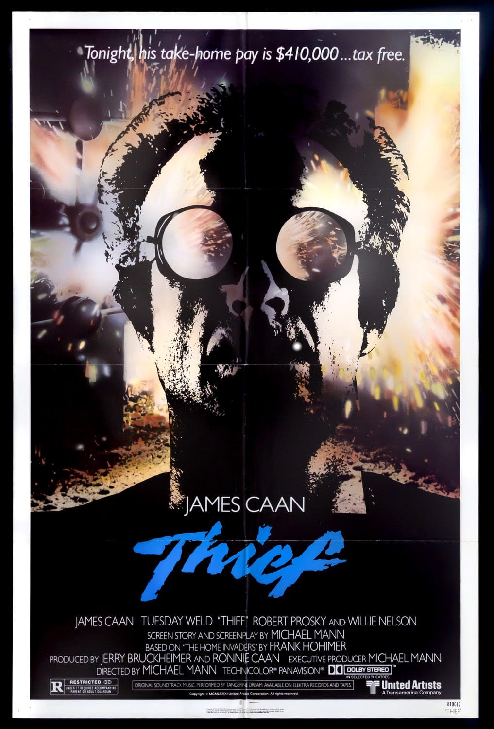
I’ve always loved optical titles in films from the 70s, so I was trying bring in influence from The Hunger, Thief, and even The Thing. Handwritten script, but it’s optically printed, so it feels like it pierces through the screen.
So those were the constituent parts, and it was just about working with my bandmates Vishnu and Chris Lawless to figure out how to bring it all together technically. Lawless owns a beautiful Bronica GS-1 that we used to shoot the shot, and then I did a ton of takes of learning how to do a big title with a paint marker on canvas paper, and photographed them digitally and Vishnu took those photos and achieved the cinematic glowy look, matching the grain of the Cinestill 120 film. It was a crazy process!
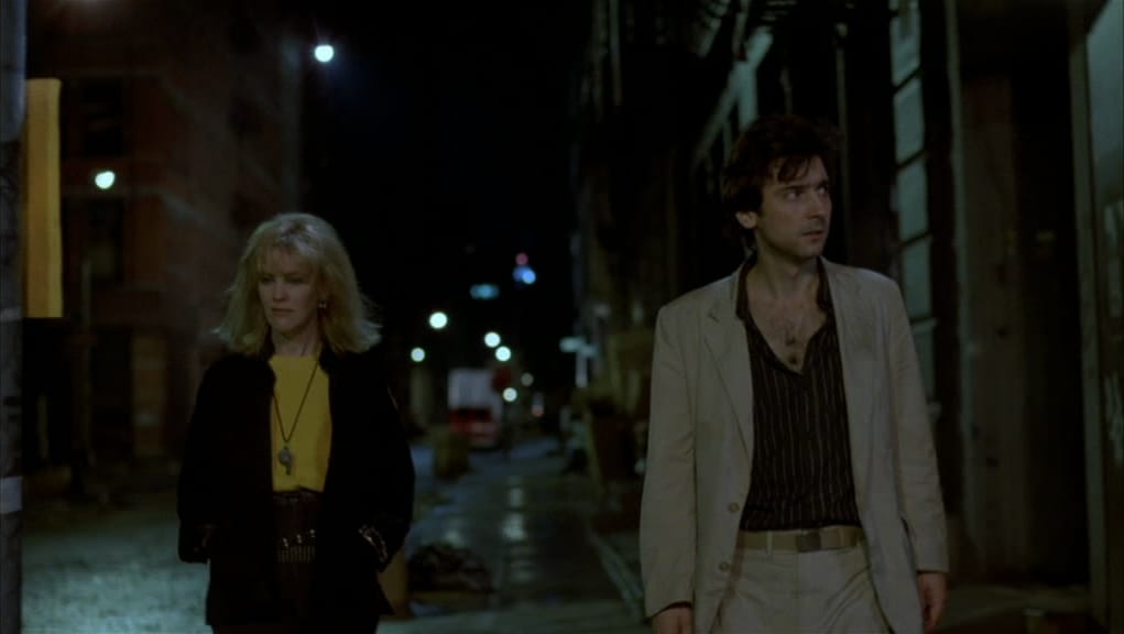
Tell me about shooting the photograph that ended up as the featured image. Did you know you had "gotten the shot"? Was it easy to choose the final photo?
I knew I wanted it to be Johns's "Lunger" character running on a dark street in New York, but this was very challenging cause I knew we weren’t going to be able to have professional lighting. It took a lot of scouting to find that location, but I think it was Johns who thought it’d be a good place to shoot? Could have been Lawless. Either way, once we found that location, I was pretty sure it was going to be great, with the american flags and gasoline, and the Manhattan skyline. But no, the actual shot was a big debate actually! There was a shot of Johns running toward the camera that was actually really good and we almost used it! There was some concern the lighting wouldn’t be good enough so we took a bunch of digital and 35mm versions as well. But I think we really lucked out finding a street corner so abandoned and yet so well lit.
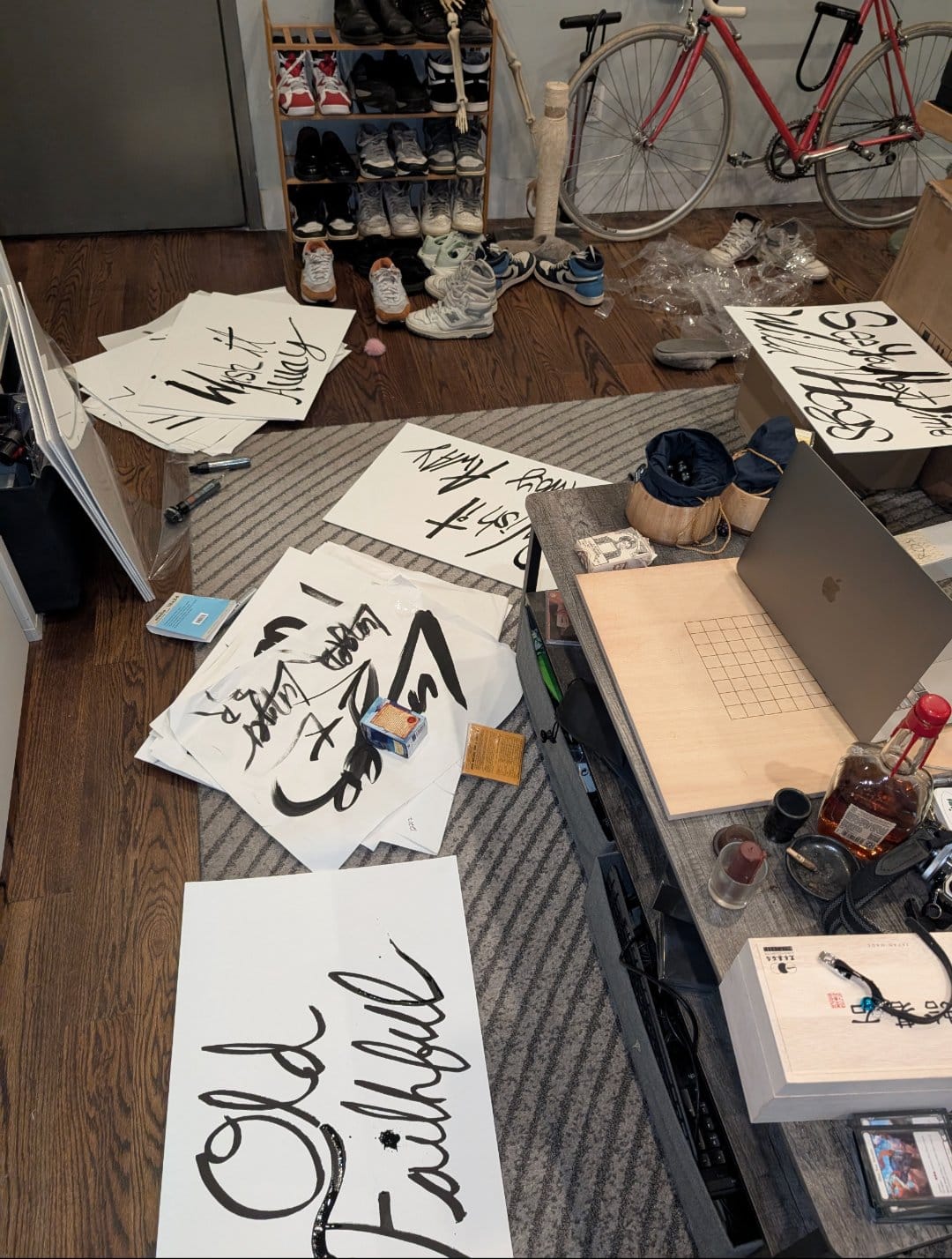
What about the hand-lettering process for the title? From your behind the scenes photo, it looks like it took some iteration!
Yeah! I got a little into graffiti writing when I was in college, and so I had practiced loose, stylized handwriting with big marker a lot, so I was somewhat confident I could pull off the vibe I was imagining, but I knew it was going to take me some time to get all the letterforms right. Plus I hadn’t done any graffiti in years! So I went to a Dick Blick and got a ton of supplies, markers, canvases, paint brushes, paint, and tried stuff out. I wanted it to look “inky” but not fully Ralph Steadman splatty. (Although a couple of the singles ended up that way and that’s kind of fun too!) I believe the take that is mostly the one used was big paint marker on canvas, after, probably 30 iterations.
I love the layout including the credits at the bottom (also "A Stay Inside Album" goes hard). What inspired this front and center copy?
Thanks! That was all a part of the idea that the record is more like a “movie” we directed. Not in that it’s a specific story or concept, but that it takes a bunch of themes and makes the songs feel like scenes you’re in. I heard Michael Judge, from the “Death is Just Around the Corner” podcast, describe Bowie albums this way, with Bowie as the “director” and, you know, Station to Station as the movie. There are a couple of Michael Judges ideas in this album… or movie, haha.
In general, what point in the album-making process are you thinking about visuals?
For me, I find it hard to not hear songs and think about visuals. Basically as soon as a riff or melody is emitting emotion, I'm imagining the video. They're extremely intertwined in my head, which is probably why I'm always trying to connect those images and overcomplicating the songs.
The Lunger art is definitely a different vibe than that of Ferried Away (also a fuckin cool piece of art). Is separating different albums into different aesthetics important to you / the band? When you start a new album cycle, are you trying to start from scratch or is there any kind of throughline you want to maintain?
Historically for us, albums have been markers of time periods. We channel the feelings of what we're going through while we're writing it. I don't think there's an intention of "reinvention" but we just tend to lose interest in doing things we've done before. It wouldn't feel true or honest to write a record about grief right now, cause those feelings from the first record have mutated and changed as we've grown as people. So Lunger is the way it is because of the schizo, paranoid feeling that is moving through all of us living in New York right now and we wanted to get it down as soon as possible. As for a "through line,? I think we're always going to sound like ourselves, and each record is just another piece of what that means.
How do you feel the look/aesthetic of the album cover aligns with the sound of Lunger?
I think it completely reflects how I want people to feel when they listen to it. I want the listener to be having fun, make connections with people, with strangers, experience the beautiful world you live in, but in your peripheral vision, see something very very bad that could very well happen to you. Mysterious, fun mania.
Thx Bryn! Stay Inside's Lunger is out now, get into it! And check out their link aggregation.
And thanks for reading I Enjoy Music! If you like it, tell a friend.