
an exploration of travis scott's UTOPIA merch
The first time I ever really engaged with Travis Scott was when I watched his 2019 Netflix documentary, Travis Scott: Look Mom I Can Fly. What made the biggest impression on me were the interviews with his fans. One by one, they breathlessly profess their devotion to Travis, a devotion indistinguishable from their enthusiasm for getting injured at his concerts. Travis Scott has saved their lives, and it would be an honor to break a bone or two in the pit for him.
I have never quite understood how Travis Scott's music inspires such ardor. The beats themselves are epic, I guess, but as Alphonse Pierre wrote in his Pitchfork review of Travis's new album UTOPIA, Travis is "an emotional blackhole on the mic." At least Drake, the paranoid king of Toronto, has an entertaining persona. I could listen to Drake leave drunk voicemails and tell women that they look exhausted all day. Who is Travis Scott? Other than a big fan of Jamba Juice? The closest I can get to understanding him is through his merch.
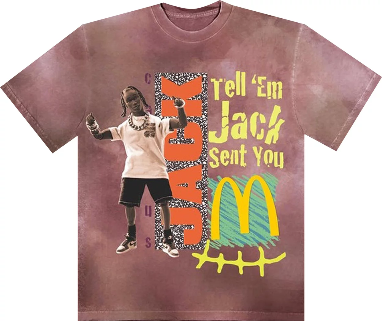
I ended up on his mailing list when he was slinging garments in honor of his collaboration with McDonald's, back in September 2020. If you had forgotten, his signature meal there was a Quarter Pounder® with Cheese, medium fries with a BBQ sauce for dipping, and a Sprite. I remember at the time finding his moderation (medium fries, not large) pleasing, his use of the sauce for fries instead of ketchup innovative, and the choice of Sprite refreshing. Travis in this mode could be understood. He was a curator of gastrointestinal experience. And the corresponding McD's merch was certainly eye-catching. T-shirts were tie-dyed mauve and covered with a chaotic collage that reminded me of Big Dog shirts from the 1990s:
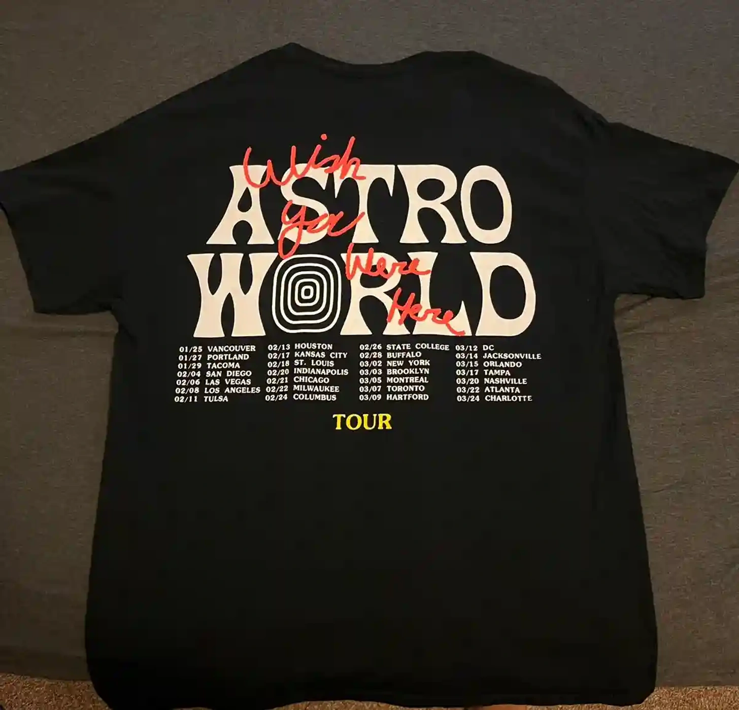
His other wildly successful clothing operation was his Astroworld tour merch. Walking around Brooklyn in 2019, the odds were high that the back of this shirt would be somewhere in my field of vision; not since the Kanye "I Feel Like Pablo" shirts had a music t-shirt so thoroughly hit. The shirt was everywhere, emblazoned with funhouse letters that evoked halcyon times at the amusement park, dumping Dippin Dots down one's throat before getting on some curly rollercoaster...ah, I get those goosebumps every time.
UTOPIA is Travis Scott's return to form after some time out of the spotlight following the crowd crush tragedy at his Astroworld festival. Everything about the release seems calibrated for a certain weightiness: the heavy load of guest verses (Drake, Playboi Carti, Young Thug, the Weeknd, Bad Bunny, Kid Cudi, Future...good lord), the ponderous beats, even the album cover, which is mostly dark, with a shirtless, straining, elaborately-belted Travis in stage performance mode illuminated in the bottom right corner.
Well, that's one of the album covers, anyway. There are five album covers. There is a film called Circus Maximus with co-directors Gaspar Noé and Harmony Korine (which recently got attention for using the A24 logo in its trailer, despite that production company having nothing to do with the film). There is a zine, which appears to feature a potent mix of imagery (people with blanked-out eyes, orca whales, metal chairs in a circle with the words "DON'T LET WHAT YOU CANNOT DO INTERFERE WITH WHAT YOU CAN DO") curated and edited by the minds behind a magazine called the Opioid Crisis Lookbook. Complex itemized the many people who contributed to Travis Scott's visuals, and the thing they have in common is a kind of raw, prestige, global artiness.
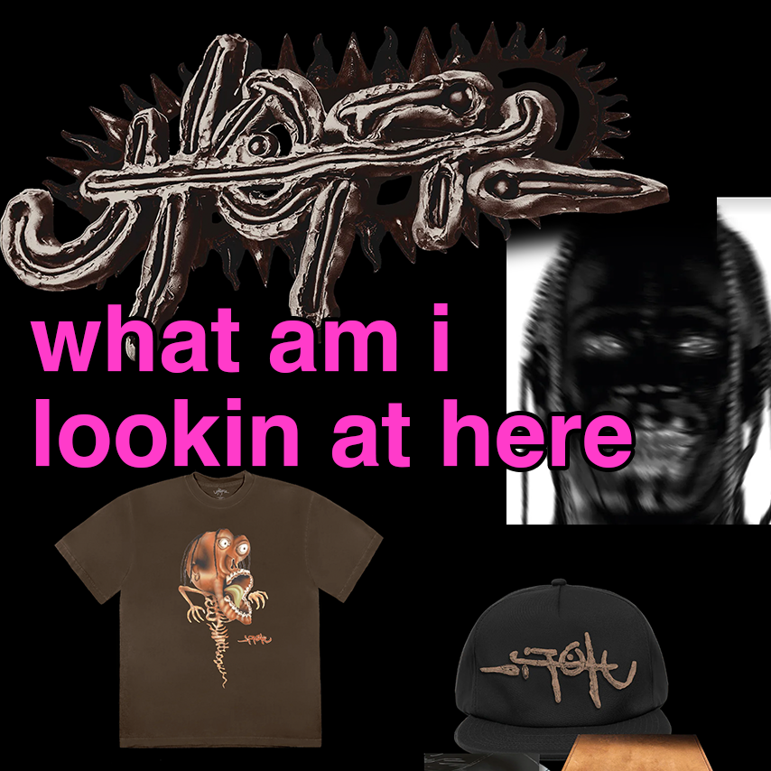
And of course, there's a good deal of merch. The vibe is....oh god, what is the vibe? Dark. Twisted. Post-apocalyptic. Somehow nu-metal-y? "What if Mad Max had a son who liked to skateboard?" "Haunted SoBe bottle?" The UTOPIA logo looks like if you took an obscure Cirque Du Soleil show title, put it in a petri dish, and did science on it:
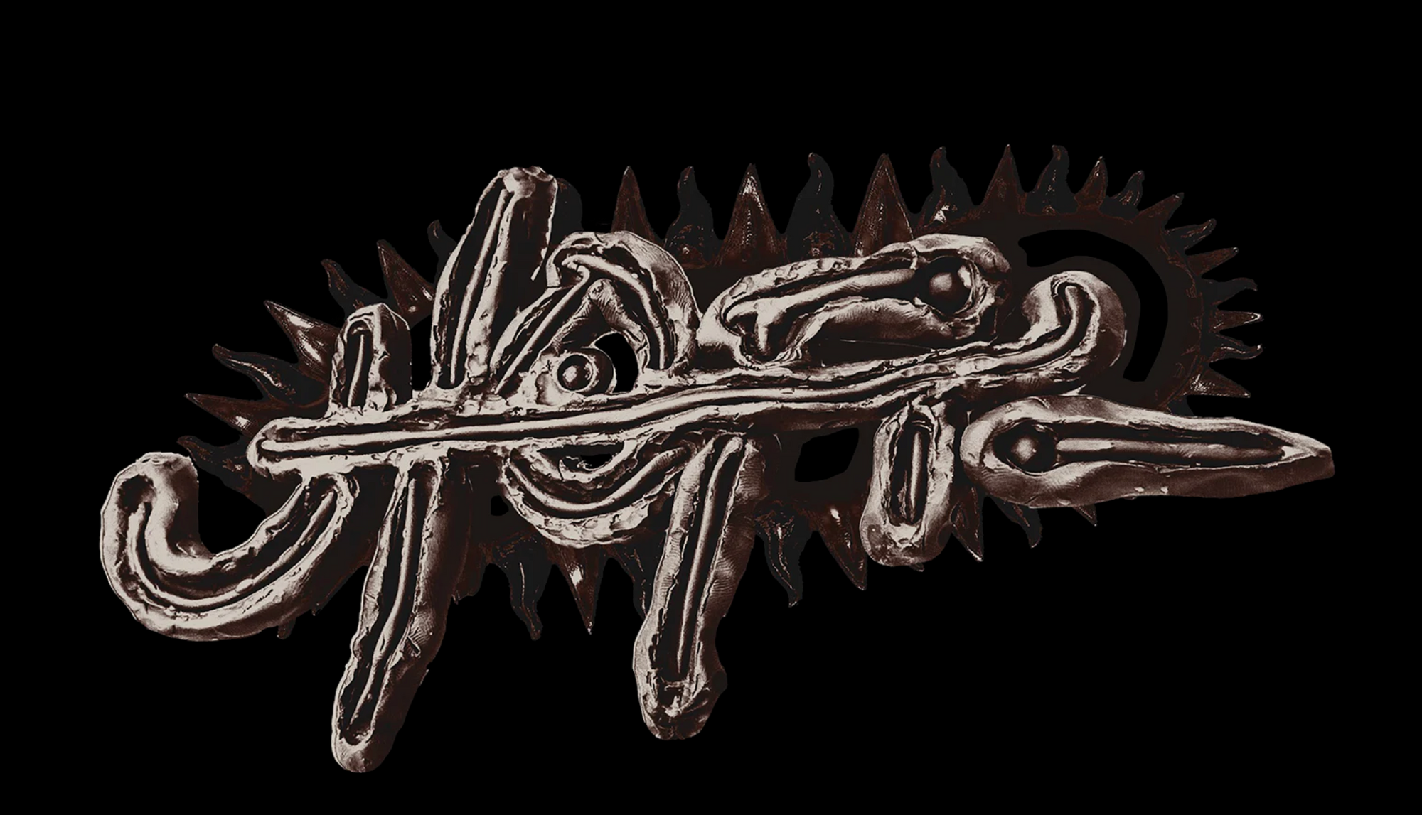
Obscure-on-purpose is definitely having a moment, aesthetically. If you've tried to read a flier for any DIY show in New York recently, you know what I'm talking about. I only wish I had seen this logo before knowing what it was supposed to spell. The cross stroke (yes I looked up the typography term, suck it) doing double-duty as the T and the P also mucks up the other letters while it's doing its thing — it doesn't give a SHIT about whether you can read.
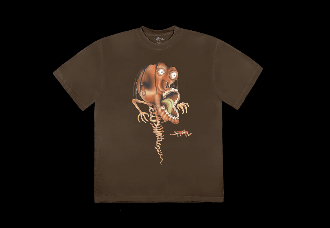
Elsewhere, Travis plays around with illustrations of his face and body, which he did before to great effect when his gaping maw served as the entrance to his fantasy Astroworld theme park. I am fascinated by the way he sees himself: he tends to emphasize his thin frame and large choppers, in this case reducing himself to a spooky cartoon head, meatless fingers, and a tapering spinal column. Is there something defensive in the way he treats his image like a caracature artist holding an especially seething grudge? I honestly cannot think of another artist who distorts their imagery in this particular way, and I wonder if this grotesque self-consciousness is something that resonates with his fans somehow. There might be power in making himself purposefully ugly.
The UTOPIA on that shirt is also fucking BACKWARD!!! Now I REALLY can't read it!!
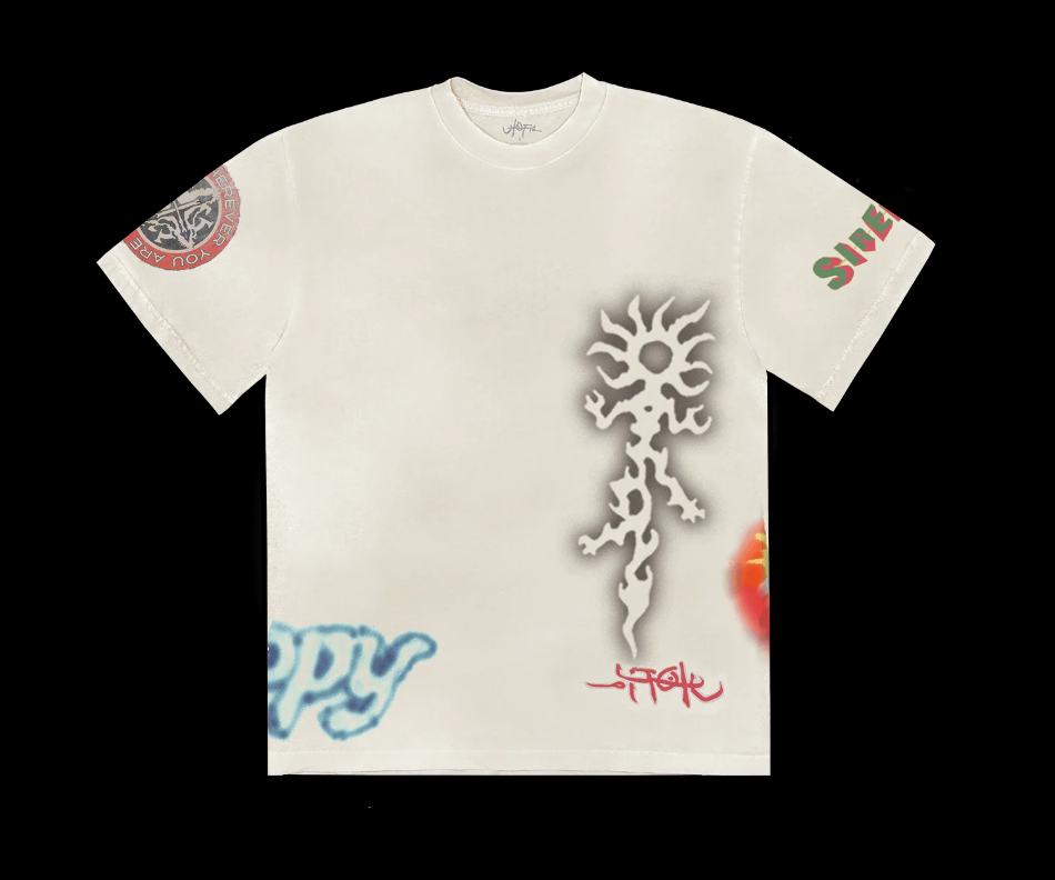
The other theme is a continuation of his McDonald's alt-90s-redux thing. In the above case, it's combining the art of the airbrush t-shirt with the art of the boardwalk henna stand. Man, this guy really loves "amusement." But dark amusement. Curdled amusement. Getting too high and then freaking out when you look at yourself in the funhouse mirror amusement.
Graphic design is literally Travis Scott's passion. He said so in PIN-UP magazine, and even posed as a G for graphic design: "It’s one of my true passions. A lot goes into graphic design. You usually gravitate to what matches how you feel or what represents your personality — colors, artwork, it all plays a part. Among my favorite American logos are Campbell’s Soup, Brillo, and Frenchy’s Chicken, which is a restaurant in Houston."
Hold the phone. Brillo??
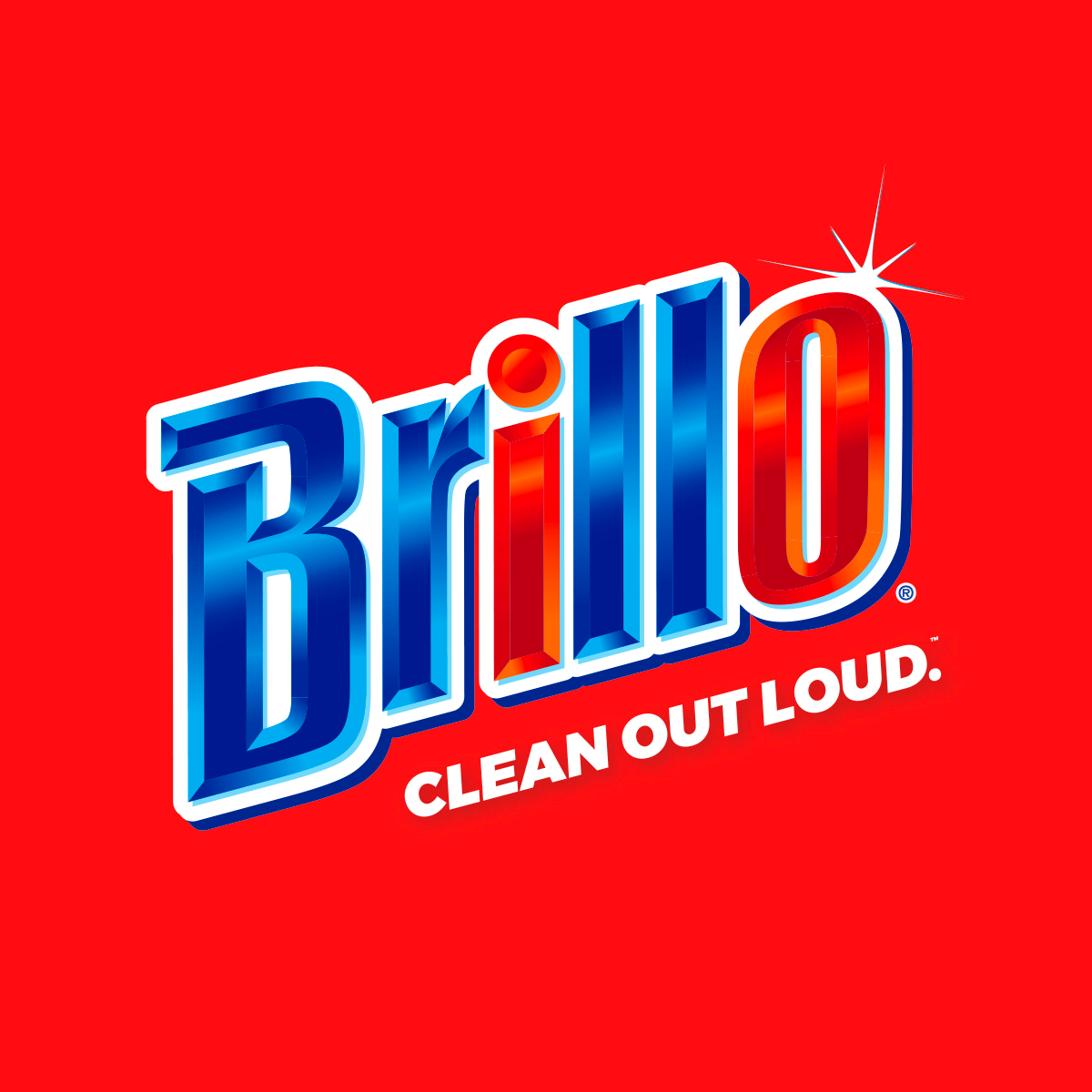
You know what? I get it. This is a stunning logo. The O glistens, presumably thanks to a thorough Brillo scrubbing. The colors are bright and primary, eye-catching in an overwhelming cleaning supply aisle. And the "Brillo" is beveled, giving an impression of a solid object, a shiny object...a clean object. I think this is a perfect logo to gravitate toward, and if anything, Travis Scott's enjoyment of it says more about him and his art than any one of his songs.
Iconic "bad man, good product" guy Steve Jobs had a mentor named Mike Markkula. Markkula wrote a memo in 1979 detailing his guiding product principles, and third on his list was the idea of how to "impute" your product's values: essentially, to demonstrate the desired quality of a product in every single aspect of its existence, from packaging to marketing to user experience to customer service. This is why Apple puts so much effort into the packaging that their products come in — the Apple experience doesn't start when you first turn your computer or phone on, it starts when you open the sleek white box it arrived in. The logos Travis Scott likes are successful at imputing what they are. The Brillo logo is bold and clean, the Campbell's logo is homey and classic, the Frenchy's Chicken logo is funky and friendly. Sponges, soup and chicken don't inherently have brands. Their logos impute the brands, give them context, and demand attention for them.
If you listened to UTOPIA without looking at a single non-music component related to its release, I am honestly not sure if the tunes would cue up the warped illustrations, deep-fried photo edits and overall foreboding of this batch of visuals. I think you would hear some very expensive music from a man who can pay for it in cold hard cash. Hence the need to impute his twistedness onto you via the album covers, the zines, the merch. Travis is not an idiot. We live in a visual world, made mostly of objects. Apparently artists who upload music to major platforms without animated artwork have their uploads marked "incomplete". Once, you could sell music and people would want a shirt as well. Now you can sell shirts and they come with some music as a bonus. We are living in the Age of the Bundle.
On paper, Travis is a man who wears Louis shades to "block his psyche," listens to Coldplay because "the world cold as shit," and who, when a female companion starts snorting too much cocaine, "had to leave, like the leaves do trees." He's always in motion, driving off his stress in a nice car or motorcycle. He is sanguine about his wins but always a little wary about the possibility of losses. He feels "painless" even when he's "fightin' Satan." There's not much of a there there, and I think he knows it, which is why the grim and edgy aura of UTOPIA comes from without instead of within. And in that way, Travis Scott's greatest success is as his own creative agency. I encourage him to spurn the Grammys this year, and instead submit UTOPIA for a Clio Award.